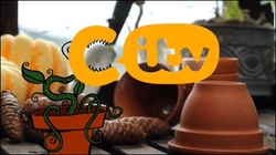
This ident features an animated Venus fly trap which eats an animated fly and burps out 'itv' in a bubble speech to complete the logo. When the plant opens its mouth it forms a 'C'
Colour Scheme
The dominant colour seems to be yellow as it's the first colour that we notice as it's the most brightest. Therefore, it stands out more. ITV's signature colour is yellow and CiTV is the kids channel of ITV so it makes sense to have the same colour running throughout the channels to let the viewers know that they all belong to the same brand, 'ITV'.
The other colours that are featured in this are dark green, for the stem and leaf plus brown for the flower pot. They have chosen a darker shade of both the colours so that the bright yellow logo is what the audience will notice and remember.
Style/Animation Techniques
The animation technique that was used for this ident is 2D digital animation and seems to be a Flash animation style. The characters and everything that was animated was 2D as they were drawn in a 2D format while the background looks 3D due to the featured realist picture.
Target Audience
This seems to be targeted at a young audience as the animation is drawn in a simple, child-like form and the colours are very bright and visually eye capturing. This type of colour scheme is usually used for younger audience as they get easily distracted and are attracted to bright loud colours. Due to the vibrant colour scheme the mood/atmosphere of the animation seems to be happy and relaxing which is perfect for the audience as it resembles them. As they would be watching the channel in a relaxed jolly mood. The font is big and curvy like Comic Sans, which is the font that is usually used for kids products as they make the letters looks simple yet fun and bubbly.
Channel Ethos
The ethos of this channel is to entertain and to educate their audience as they are at the age of learning. In order to achieve their ethos they provide exciting action cartoons and shows to entertain them, along with having shows like 'Art Attack' to educate them.
 RSS Feed
